Anything but Black and White
When The Artist won the 2011 Academy Award for Best Picture, I remember being confused. In an industry so focussed on technological advancements, with 4D viewing experiences and IMAX forced on audiences with each new blockbuster release, how could it be that a black and white film could be regarded as the best? Sure, the plot of a love story between silent film actors would seem to lend itself to the format, but equally this could be seen as being a bit on the nose and as such, I wouldn’t have been surprised if the creators wanted to use glorious technicolour.
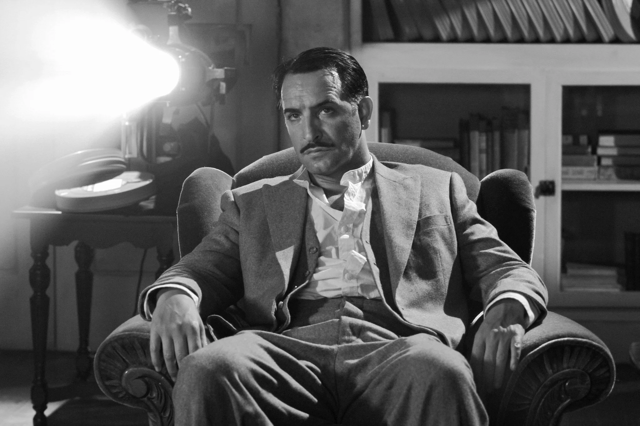
The Artist (2011)
But no, black and white it was; the first black and white film since the *mostly* black and white and thematically-adverse, Schindler’s List to win the big one at the Oscars. So why is it that a film about love and a film about grief both choose to use the same visual styling to tell their stories?
The answer lies in humankind’s obsession with thinking about the past, whether through a positive or negative lens. In the case of The Artist, the black and white staging gives us a chance for nostalgia. We look back not only at what we perceive to be a simpler time, but what is a far simpler story to many of the films which fill our cinemas today. In the case of Schindler’s List however, we look at the past not with nostalgia but with quite the opposite emotion. Through a monotonous lens, we as viewers are given an unwavering glimpse into a harrowing story. Colour in this instance would only serve to distract, by using black and white, Spielberg can ensure that our concentration remains where it needs to be.
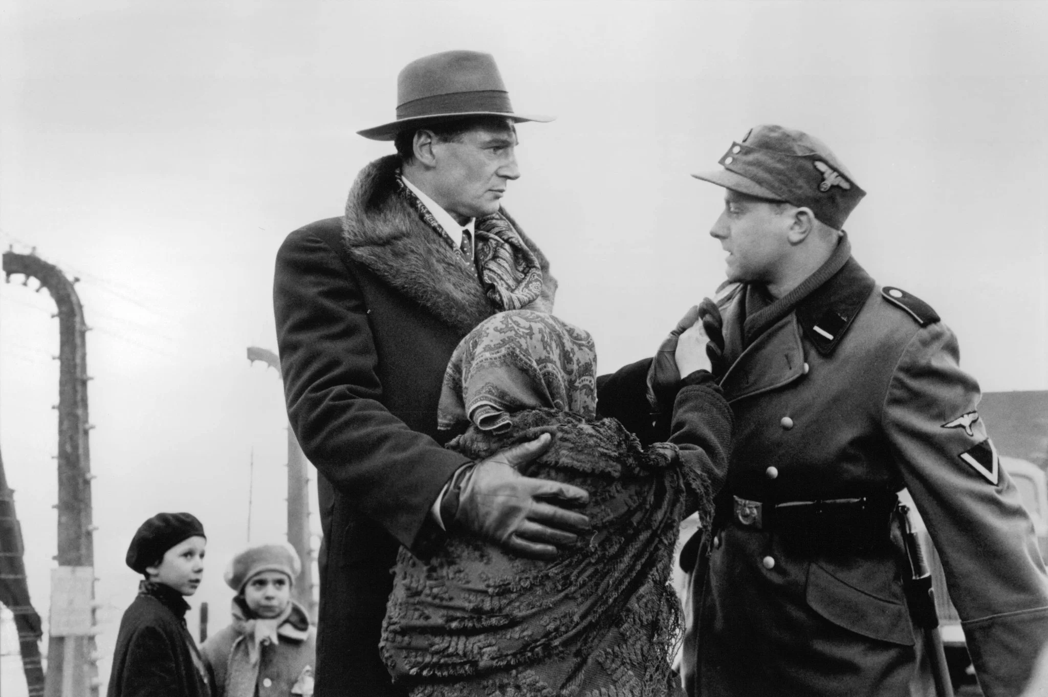
Schindler’s List (1993)
Of course, black and white imagery was not always a choice of filmmakers and photographers. Before the 1950s, for the most part, it was a necessity. Where I find the interest is that we are still seeing it used today, and we’ve been seeing it used ever since the advent of colour film, an invention which it would be easy to assume would render the black and white medium obsolete.
Helmut Newton’s career straddled the emergence of colour film and yet his stylised, perfectly-posed and intricately-executed brand of fashion photography is almost purely monotone. Whilst in the years preceding his death in 2004 Newton had began to experiment more with colour, without doubt his most famous work is rendered in perfect black and white. The reasoning is, rather strangely, very similar to that of Schindler’s List. Newton wanted to place focus on the clothes and the models, nothing else. Colour would bring muddiness, flatness and distraction; black and white brings impact, clarity and focus. The high level of contrast only serves to aid this effect; a perfectly black dress covering a perfectly white body.

Helmut Newton; Thierry Mugler (Monaco 1998) © Helmut Newton Estate
Daido Moriyama’s career on the other hand sits exclusively after the mainstream surfacing of colour film and yet, his hard-hitting, challenging and honest portraits of Japanese street life are exclusively captured in black and white. Contrary to Newton however, Moriyama is aiming to express anything but perfection; he wants to show the truth of the imperfections of the back alleys which weave their way through his home city of Osaka, acting as theatre stages upon which debauched characters play. Moriyama’s use of black and white therefore is similarly to be impactful, but also to give an abstraction to his scenes. By maximising contrast in an image, it forces a viewer to look harder, forcing them to properly delve into the work whilst also giving an often-unflinching sense of horror to the frames, distorting recognisable forms into monstrous characters.

Daido Moriyama, Untitled, Tokyo (from the series A Hunter), 1970. © Daido Moriyama
An Experiment...
An Experiment...
Now, if we take the photo below, we’ll see that straight out of camera the composition is balanced and dynamic, but it lacks any true impact. Your eye travels around the image without any true focus and the subject of the woman is easily lost.

Now, by editing the shot with a high contrast black and white effect, we can see that the image becomes abstracted. It is no longer a woman walking through a corridor but a humanoid form trapped in a metallic labyrinth. By simply eliminating colour, we promote imagination. Note as well how much easier it is for your eye to focus on the subject, the brightened diagonal pillars lighting the way.

I think the main learning from looking at the place which black and white holds in today’s world is to promote a culture of patience. If we are slower to discard old technologies and styles in place of new, we may find instances where their value, character and process can continue to give value. Is it more important to make something perfect in a technical sense, or something perfect in its meaning?