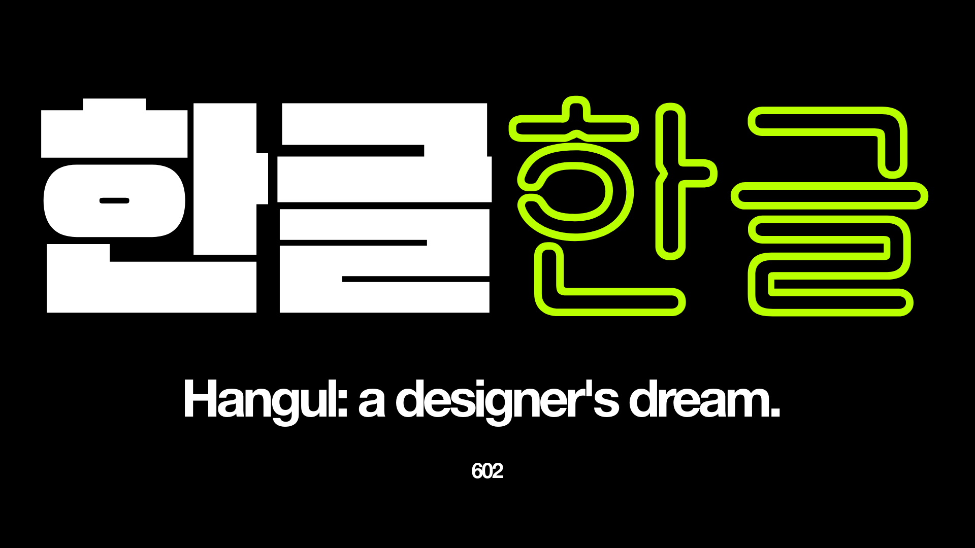
Hangul: a designer’s dream.
Imagined alphabets are commonplace in today’s popular culture, used to add depth to fantastical worlds. Whether Dune’s Fremen, Star Wars’ Aurebash, or the fleeting use of an eerily AI-inspired script in Cronenberg’s Infinity Pool.
In 15th-century Korea however, the complexity of the written language was proving to be an issue. Whilst the educated upper classes and scholars were able to communicate through the hundreds of unique characters, mainly derived from Chinese, the vastly outnumbering lower classes could not.
Rather than accept this as a mere fact of life, the reigning King Sejong decided to do something about it.
Hangul is the result of roughly two months’ work from the King and his court: an invented alphabet where the 24 basic and 27 complex letters are stacked into single-syllable blocks with the aim of making it as easy to learn, and use, as possible.
Through the immediate backlash from the scholarly classes, as well as a complex history of suppression through Japanese annexation, Hangul proudly stands as South Korea’s official alphabet, and it’s a designer’s dream.
First, I’m going to lay out what I think is important in type design:

Balance
Hangul is written in single-syllable stacks and this blockiness means that it has an ingrained sense of balance. Whether two or one letters wide, the blocks will take the same height and width as each other meaning that stackability is guaranteed. This means that no matter how many syllables a word is, it’ll be able to align near-perfectly with one above or below.

Flexibility
Scalability is one of the most difficult aspects to incorporate in good design, with it being important that a typeface can be read clearly at very large as well as very small sizes; think a billboard and the back of a ketchup sachet. The simplified structure of Hangul lends itself to this perfectly with the basic forms remaining clear due to the ample kerning.*
*The spacing between letters in a typeface.
Impact
Perhaps the most important aspect to a graphic designer is the impact. When used correctly, the basic form of Hangul has the same effect as block capitals in the Latin script. Its symmetry and inherent boldness are immediately eye-catching, whatever the typeface. Just see below at how much more striking the Hangul script is…
The reason why Hangul is a designer’s dream is more than this though.
Imagine receiving a brief to design a new language system from scratch. Two months to create a new culture of communication which needed to work, not purely for the educated bourgeoisie, but for everyone - to give the people a voice. If we use Dieter Rams’ Principles of Good Design as a metric, we can evaluate the success of Hangul.
Hangul is the very definition if Innovative, the first principle. It wasn’t requested, King Sejong thought of something which nobody knew was needed. This reminds me of the classic Henry Ford quote “If I had asked people what they wanted, they would have said faster horses.” Great design looks beyond improving something, and towards creating something.
Principles four and ten suggest than good design both makes something understandable and is as little design as possible. The fact that complex words can be represented by a collection of highly-simplified shapes is the beauty of Hangul. The perceived romance of the Chinese characters was devalued by its inception, creating a new philosophy of efficiency or, as little as possible.
“A wise man can acquaint himself with them before the morning is over; a fool can learn them in the space of ten days.” – King Sejong
The penultimate principle to mention is number seven, that good design is long-lasting. It is incredible to think that the same system designed within sixty days in the fifteenth century remains, almost identically, today. The aim of system design is to think of every combination, eventuality and possibility and to create effective solutions. The design thinking involved in the creation of Hangul was ahead of its time and yet it’s interesting that, in spite of its long-lasting success, other languages haven’t followed.
And finally, it would be amiss to not mention principle number three, than good design is aesthetic. As a designer, the minimal elegance of Hangul is why I’ve come to love it. The geometry, spacing, balance and impact are truly enticing. However, don’t be blinded by its beauty; the system working away in the background is efficient, extensive and effective. It’s amazing that even a rough understanding, from minimal study, allows a non-speaker to verbally navigate South Korea’s towns and cities – sounding words out one syllable at a time.